Wind and Solar vs Coal, Gasoline, Nuclear

liveforphysics said:
Topaz was $4.50-5.00/Watt, which was pretty good installed cost 5years ago.

Modern solar farms are <$1/Watt installed, even at smaller scales.

They are quoting grid scale solar at $2.13/ W in my area of NY state and it will produce 15.7% capacity factor annually and near 0 all winter. If only we could really build intercontinental transmission at a scale of 10 TeraWatts to replace everything. And also build 10TW of generation.
.
http://energy-age.blogspot.com/2015/11/intercontinental-energy-grid.html
.
 
Hillhater said:
No citations needed...its all common knowledge !
(This is the adult world ... Do your own home work )

Usually the burden of proof lies with the one making extraordinary/unlikely/whacky claims, but whatever, I can take literally a few minutes of basic google searching to demolish your out-dated denier myths.

Energy payback time for a PV panel:

1-4 years (https://www.nrel.gov/docs/fy04osti/35489.pdf)

3.5years somewhere sunny, 7 years for somewhere not sunny (http://info.cat.org.uk/questions/pv/what-energy-and-carbon-payback-time-pv-panels-uk/)

All based on a 25-30 year service life and note both citations above are fully referenced. Payback time of 0.5-1.0 orders of magnitude less than your ridiculous claim. Just for bonus, the CO2 emissions involved in manufacture are there too.

This also makes nonsense of your claims you can't use solar energy to produce solar panels (in fact a solar-powered PV factory is an awesome idea) and that you'd be better off using that electricity for heating. Also solar doesn't work "in many parts of the world"

"Solar doesn't work 70% of the day". Intuitively wrong. Every location of earth is daylit for at least 50% of the year: (https://en.wikipedia.org/wiki/Sunshine_duration#daylight_duration)


Why not go and actually read something and educate yourself instead of lazily repeating denier propaganda and misinformation?
 
Hillhater said:
So you do acknowledge that an EXTRA increase in surface temperature CAUSES a corresponding EXTRA increase in CO2 emissions ?
And if "EXTRA" temperature increase, results in EXTRA CO2, ....is it not possible that the recorded recent "baseline" increase in surface temperatures might just be a cause of the corresponding recent increase in CO2 levels ?
...or would you explain why if that definitely NOT the case for some reason ?
30+ bn tonnes sound impressive...until you consider what +_10% variation in the natural emissions ..and corresponding reduction in sink rates...are in comparason
Natural variations such overwhelm FFuel emissions by orders of magnitude.... as is shown in that paper.

If you really think it works like that, show me your model. Also, where did you get that graph from, because it is not right--or at least it is not showing global average temperature trends because global average temperature does not have 40C swings. I'm guessing you got it from some UAH publication by Roy Spencer, who is a well-known denier who repeatedly has misinterpreted the satellite data.
 
Punx0r said:
Every location of earth is daylit for at least 50% of the year: (https://en.wikipedia.org/wiki/Sunshine_duration#daylight_duration)

Why does Germany's vast solar PV build out only average 11% capacity. Does that qualify as work? Or not work? NE USA and all of Russia will be the same. Obviously many days on end of near zero to end up that low annually. So the latest recommendation to the poor capacity factor and intermittency/ storage issue is a multi TW grid connect from NE Europe to the Sahara.
 
Hillhater said:
MKbMro.png

Where are you getting this graph of HADCrut data from, because it is not correct. The real data shows no "hiatus."
See for yourself here: https://www.metoffice.gov.uk/hadobs/hadcrut4/diagnostics.html
 
Hillhater said:
:shock: That is some pretty creative (deceptive?) trend lines overlaid on there. !
you would have to be "blind Harry" not to accept that the observed results show a leveling off in the slope of the temperature graph after 2000...as clearly demonstrated through to current date on multiple data sets available from reputable sources.
That's because it only went through 2012.

Here's one through 2016:
2017EarthDay_TempAndCO2_en_title_lg.jpg


That's the reason that, in the end, climate deniers will fail. Back around 2000 they had a rallying cry - "there's only one problem with climate change - it ended in 1998!" They said this because 1998 was a strong El Nino year, and so saw very high temperatures. Afterwards, the normal warming trend didn't look so dramatic. The "pause" as they called it was proof that global warming was over.

Of course, they quietly abandoned that claim once the 1998 record was broken in 2005, 2009, 2010, and 2013 - and then shattered in 2014, 2015 and 2016.
 
Hillhater said:
Hillhater said:
.. As i said above, you have to be blind to not see the change in trend since 2000.
It might have helped them get a better handle on it if they had used up to date data over a longer time period ..
MKbMro.png

BTW I replotted your graph with the HADCRUT4 temp data and the Mauna Loa measurements. Here's what that looks like without your cherrypicking:

scale:1
 
Hillhater said:
A solar panel takes 25+ years to produce the equivalent amount of power to that which it took to manufacture the panel initially.
It takes 1-10 years, depending on where it's used and how it is manufactured.
$1/W is possible in places where labour rates allow.
Those levels of cost have never been achieved in the Western world.
I've done it, for a 3kW array.
 
Copy of my post from ecomodders:
.
Roadmap To Nowhere puts some numbers and math that was missing from the Solutions Project into the equation to show the scale of trying to replace all energy with rebuildables.
.
http://www.roadmaptonowhere.com/
.
David MacKay was an engineer that also did a good and open minded study of the feasibility of rebuildables replacing all energy. Or even trying just to just replace all electricity. Which is only 20-30% of total energy consumption.
.
https://www.withouthotair.com/
.
Nate Hagens is a very modest genius who has devoted the second half of his life to studying a synthesis of everything from energy, economy, ecology, psychology, evolution. And stands on the shoulders of many giants which he links to in his University course which I was honored to shadow from home last fall. I am very anxiously waiting the download release of his two, 1,000 page , free, books, so that I can have a quicker reference to the compiled facts.
His video presentations are essential to an educated person's understanding of where we are going and are a very easy watch. The key take away for me was understanding the concept of embodied energy and the 300 fossil slaves holding each American up right now. He needs work on his site and youtube channel though
.
https://youtu.be/YUSpsT6Oqrg
.
https://youtu.be/rrN0lbbSVOA
.
 
jimw1960 said:
Where are you getting this graph of HADCrut data from, because it is not correct. The real data shows no "hiatus."
See for yourself here: https://www.metoffice.gov.uk/hadobs/hadcrut4/diagnostics.html
The data is original Hadcrut... so i assume correct, and if you cannot see the change in the trend, ..its because it doesnt fit your model .
....But do some basic analysis , and you will find the change points and tha "hiatus"

billvon said:
BTW I replotted your graph with the HADCRUT4 temp data and the Mauna Loa measurements. Here's what that looks like without your cherrypicking:

scale:1
?? Cherrypicking, what???
All you have done is added the 2015/2016 data.. ( which is the El nino effect as identified in the NASA paper previously ),.... and deleted the lines which highlighted the change in the trend. :roll:
PS:- It is very unprofessional to present a graph without an axis scale for the data !
 
Hillhater said:
jimw1960 said:
Where are you getting this graph of HADCrut data from, because it is not correct. The real data shows no "hiatus."
See for yourself here: https://www.metoffice.gov.uk/hadobs/hadcrut4/diagnostics.html
The data is original Hadcrut... so i assume correct, and if you cannot see the change in the trend, ..its because it doesnt fit your model .
....But do some basic analysis , and you will find the change points and tha "hiatus"

I gave you a link to the HADCrut4 data straight from the UK Met Office, which clearly is different from the graph that you showed, with no link or source reference, and conveniently left off the two hottest years on record (i.e., cherry picking). No analysis or model involved. While you are busy looking up the correct HADCrut4 data, why don't you also check out the independently developed global average temperature data sets from JMO, NOAA, and NASA, Berkely Earth, etc., which also all show a clear warming trend and no "hiatus."

Still waiting for you to show me your model for how you can add 30 billion tons of CO2 to the atmosphere every year and not cause warming. You claim it is a small percentage of natural CO2 and therefore will have no affect. OK then, show me your model. Should be easy, you'd think someone would have done it by now.
 
Construction on Gigafactory 1 seems to have stalled since August. And why is there not a single solar panel in sight yet?
.
.
tesla-gigafactory-drone-photo-jan-2018-splash.jpg

.
.
https://www.teslarati.com/tesla-gigafactory-1-photos-jan-2018-construction-update/
.
 
Hillhater said:
?? Cherrypicking, what???
All you have done is added the 2015/2016 data..
Right - which you removed because you thought it made the data "look bad."

When you intentionally remove data to try to make your point look better - that's cherrypicking.
 
sendler2112 said:
Construction on Gigafactory 1 seems to have stalled since August. And why is there not a single solar panel in sight yet?
Because you are using old photos.

These are pictures from March showing the first segment installed:

tesla-gigafactory-1-solar-rooftop-array


Story here:
https://www.teslarati.com/tesla-gigafactory-1-solar-rooftop-array/
 
billvon said:
Hillhater said:
?? Cherrypicking, what???
All you have done is added the 2015/2016 data..
Right - which you removed because you thought it made the data "look bad."

When you intentionally remove data to try to make your point look better - that's cherrypicking.
I didnt add or remove any data.
Much like you with your chart to 2012 , and the latest to 2016 , i simply posted an existing chart.
So if i was "cherrypicking" by using a dated chart, what were you doing with your updated data that omitted the 2017/18 data points that show temps dropped below 2014 levels.?
.....or did you think that might make you data appear less convincing ?
The NASA paper clearly explained the influence of el nino in 20'15/16, detailing how the increased temperature boosted the CO2 levels, rather than the reverse which you believe.
 
Hillhater said:
I didnt add or remove any data.
You used a chart with years that disproved your theory removed. Funny, I used exactly the same site and got those years. You'd have had to edit the year range to exclude those two years.
The NASA paper clearly explained the influence of el nino in 20'15/16, detailing how the increased temperature boosted the CO2 levels, rather than the reverse which you believe.
So you cherrypicked in order to remove them.

Strange that you don't remove the year 1998 (a very strong El Nino.) Of course, doing so would remove the "flattening" you claim in your graph - so you chose to leave that one in. And I am sure that if 2018-2020 are slightly cooler than 2016 (also likely since 2016 was a strong el nino year) you will suddenly very much want to include 2016 because then you can claim another "pause."

Rejecting data that does not fit your agenda, and emphasizing data that does, is the hallmark of a denier.
 
sendler2112 said:
That's better. Trackers?
I have a feeling they are not trackers. Solar is cheap enough now that it's cheaper than to just get more panels than get a tracker installed. There are still a fair number of tracking plants out there, but they really only make sense when you have a very large, flat ground mounted array where weight, vibration and size aren't big issues.
 
billvon said:
Hillhater said:
I didnt add or remove any data.
You used a chart with years that disproved your theory removed. Funny, I used exactly the same site and got those years. You'd have had to edit the year range to exclude those two years.
The NASA paper clearly explained the influence of el nino in 20'15/16, detailing how the increased temperature boosted the CO2 levels, rather than the reverse which you believe.
So you cherrypicked in order to remove them.

Strange that you don't remove the year 1998 (a very strong El Nino.) Of course, doing so would remove the "flattening" you claim in your graph - so you chose to leave that one in. And I am sure that if 2018-2020 are slightly cooler than 2016 (also likely since 2016 was a strong el nino year) you will suddenly very much want to include 2016 because then you can claim another "pause."

Rejecting data that does not fit your agenda, and emphasizing data that does, is the hallmark of a denier.

Which part of ..."i didnt add or remove any data, ...i posted an existing chart" .. dont you understand.?
Remember i was extending your "2012" data , not attempting a full and comprehensive analysis.
.....Which by the way , entirely misses the point being made..
Temperature is NOT the result of CO2 levels, but it does force more CO2 into the atmosphere..even if it is not the only cause.
 
Hillhater said:
Which part of ..."i didnt add or remove any data, ...i posted an existing chart" .. dont you understand.?
Oh, I understand your claim. I think you searched high and low for a chart that had that data cherrypicked - and then you used that one without any second thought because it supported your agenda. You are now claiming "I just posted a chart that had someone ELSE cherrypick the data!" really isn't much of a defense.
[quote Temperature is NOT the result of CO2 levels, but it does force more CO2 into the atmosphere..even if it is not the only cause.[/quote]
Causes of anthropogenic warming:
ipcc_rad_forc_ar5.jpg
 
sendler2112 said:
That's better. Trackers?
You can see a huge substation right here with transformers the size of trucks
https://cdn.teslarati.com/wp-content/uploads/2018/01/tesla-gigafactory-drone-photo-jan-2018-3.jpg

You can see the factory is very much alive by the huge amount of factory worker cars parked outside.
Obviously, the plan was to set up and start battery manufacturing using more reliable sources of power to run the factory and try and utilize a project of using renewable power as a sideshow for marketing purposes, which has so far always been very effective for Tesla/Musk.

It wouldn't really matter if they covered the roof a year or two later with solar panels and claimed the factory has been running entirely off renewables since the beginning, most people would believe it, that's all that matters.

On a side note, the worlds biggest investment bank (the one Warren Buffett famously has a large personal investment stake in) says Tesla may need $10 billion dollars of fresh cash before 2020.
http://www.businessinsider.com/tesla-stock-price-tesla-will-need-10-billion-in-fresh-cash-before-2020-goldman-sachs-says-2018-5

If you have no idea about business financials the easiest way to understand this is due to the fact a lot of the corporate debt issued to Tesla needs to be repaid and as you can see here on this financial sheet for Tesla its around $9billion dollars.
ctrl+f "debt"
http://markets.businessinsider.com/stocks/tsla/financials
 
Hillhater said:
Two things wrong with that bill...
1). It assumes the warming is anthropogenic ..
That's because it is a list of anthropogenic sources of warming and cooling.
2)... Its missing the word " theoretical".
Correct. They are not theoretical. They are measured. It has error bars and everything.
 
Thought I would post some articles on energy.

I look at articles like these almost every day but rarely post them, but since its getting slow on here I thought I may as well.

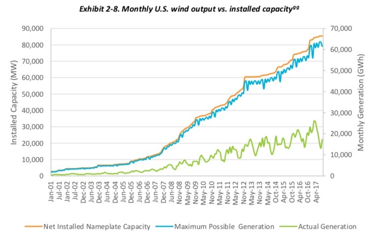
Installed Capacity vs Actual generation.
This is something I find frequently when looking at wind-farms, the bigger they are the worse the general performance is, I guess as it gets bigger its harder to hide it.
https://www.masterresource.org/windpower-problems/installed-wind-rest-story/
Wind-Generation-1-1.jpg


https://alfinnextlevel.wordpress.com/2018/05/19/wind-powers-limits-to-growth/
I think the biggest flawed model the energy industry has at the moment is the LCOE model, because on it wind looks OK but the 'real model' of what the retail end user pays in their bills is massively different for states that rely heavily on wind-turbines for their energy.
1501829123113 (2).png

In Australia, there are claims that coal-power is seriously subsidized. Which is a weird thing to claim unless you're mentally challenged as far as I am concerned, because governments wouldn't be tripling the coal taxes on a whim.

Just like this article well placed in history proves. They tripled the coal-tax for a coal-power station, about 1 month later the coal-power station announced its shutting down for good. And electricity prices doubled, the government was so clueless about the electricity market that when they tripled the coal tax they even had the gusto to rant to the public that it won't put up the price of electricity even a tiny bit.
https://www.theage.com.au/national/victoria/victorias-own-mining-tax-to-triple-as-treasurer-gouges-brown-coal-for-revenue-20160422-gocymk.html

Some numbers on renewable subsidies that get paid on for wind/solar farms
https://pbs.twimg.com/media/DdrcUtkVQAAjKNR.jpg
https://pbs.twimg.com/media/Ddrb3sNVQAA6I7t.jpg

American politician talking about how silly carbon taxes are.
Saskatchewan families and businesses have made it clear: they’re not on board with the carbon tax shell game.
https://twitter.com/PremierScottMoe/status/997859160078233601

Since Twitter started supporting larger video embedding, its taken away youtube embedding on the forum, same with Facebook. Both of these platforms are out to take a large chunk of Youtubes market share, for smaller videos at least.


If Renewables Are So Great for the Environment, Why Do They Keep Destroying It?
https://www.forbes.com/sites/michaelshellenberger/2018/05/17/if-renewables-are-so-great-for-the-environment-why-do-they-keep-destroying-it/#1f5ce3333a1c

https%3A%2F%2Fblogs-images.forbes.com%2Fmichaelshellenberger%2Ffiles%2F2018%2F05%2FGolden-Eagle-Adler-Nature-Feather-Wild-Bird-Bird-1728224-2.jpg

This article above is deep in whats in my mind with renewables, the huge land footprints means killing the environment its meant to save.
If only polar bears etc weren't at record high numbers maybe somehow I could support cutting down all the trees to install solar panels and wind-turbines.
'They're everywhere': has the decline of the seal hunt saved the polar bear?
https://www.theguardian.com/world/2018/may/24/canada-polar-bears-labrador-rigolet-seal-hunt?CMP=share_btn_tw
This is why I wish folks would ask what its all for? and get some perspective... Why not wait for next gen Nuclear as the only clear proof environmental destruction from climate change is from the roll out of huge renewable-energy projects, as the polar bears etc are in record numbers.

For me its the Gympie solar farm in Australa thats going to be one of our biggest, it sits in between solar koala state forests. I understand why they put it there, simply because the builders of it want the renewable energy susbsidies, because once the solar farm is built its a licence to print money (by the recorded MWh at least).
Putting the solar farm in a location thats green already means you don't have to clean off the dust from the solar panels and its right next to the main transmission towers in Gympie so you don't need to build very long power-lines to carry the power out. But its all at the cost of the environment.
These renewable energy subsidy farmers are the next generation above ugly apartment block towers that were built simply for the return on investment and no thought what so ever about how it affects everything else.


Finally, I have always wondered how the Greens party Australia must feel about nuclear power and CO2. I am absolutely sure they know that France emits 20 times less co2 then the average other country that doesn't have mountains for unlimited Hydro etc.
Compared to other countries France could almost be thought of as co2-less on eletricity generation.
Because The Greens party is about better environment they wouldn't be doing their job / if not the core of their knowledge that nuclear energy kicks arse in low co2 emissions, and its the only technology that can perform well and have it anywhere you want and not rely on the geology of the area.

But I know why the Greens hate nuclear, merely because they know the average folk doesn't know anything about Nuclear and are fearful of it. Its all about the votes/political power for them, as well as the monetary gain that power provides, literally nothing else matters.
I can't believe most Greens voters haven't turned to https://www.sustainableaustralia.org.au/ , I guess because mainstream media continues to do a terrible job informing people there are other environmentally caring political parties out there, that are about more than gaining power.
Ddjk1rdX4AEf-Q4 ().jpg
 
Back
Top