
Not to put words in Tek's mouth, but I think that the backlight dissipates some of the energy that would otherwise be dissipated in the regulator - so the "replacement" would likely be a series of diodes or something to dissipate a similar amount of energy and drop the voltage for the regulator. There might be a way to carefully choose that replacement to reduce the amount of energy dissipated - although if it's an LDO then there's always going to be a fixed amount of energy that gets turned into heat while the CA is on.solarEbike said:I've noticed that brightness of the backlight is occasionally mentioned during troubleshooting so I had a feeling you might say something like that. I think I'm going to leave the backlight alone for now so please don't go to any extra effort unless others express an interest.
The conspicuousness of the backlight at night was one reason for asking. I guess I can just cover it for now if I feel the need. The other reason was suspected current drain which I just measured to be 50 mA at 41.5V for my CA3 with backlight on and Sempu BB plugged in.
You are using an out of date browser. It may not display this or other websites correctly.
You should upgrade or use an alternative browser.
You should upgrade or use an alternative browser.
My Sun Trip Bike, Back to Back Tandem Trike with Rowing Generator, Pedals, +Solar
- Thread starter justin_le
- Start date
If you don't mind the wasted power, you can use a common ICL (inrush current limiter) NTC, like some power supplies/chargers use.solarEbike said:The autopsy revealed heavily pitted contacts. I guess it's arcing due to inrush current on the converter. I think I'll just replace it with a beefy toggle switch but that's just kicking the can down the road. I've read up on adding soft start circuits to mitigate this but that sounds like more work than I have time for right now.
https://www.google.com/search?q=icl+ntc&ie=utf-8&oe=utf-8
(Not to continue this OT discussion too much longer, but...) Yes - that's exactly the case...billvon said:...the backlight dissipates some of the energy that would otherwise be dissipated in the regulator...

Anyhow, I had forgotten I'd already written up details on this topic in the CA beta thread a year or so ago...
See this post (and few later for JLE's additional remarks):
Cycle Analyst Mods for LCD Backlight Color / Brightness
philf said:Speaking of "Perfect Days"... When exactly is yours, Justin? This coming weekend? (Apologies if it appears elsewhere - you guys have been all over the various media, but everything I've read merely alludes to the month). I don't think I have the power to will every day in August to be perfect for you and Anne-Sophie, but I'll try
Well, your will power must be good since all of August ended up being quit special! The actual wedding was Aug 11th so we had exactly 2 weeks between flying back from Iran to getting everything planned and organized for the ceremony and all that. And we juuuusst pulled it off, thanks in no small part to lots of help from AnSo's and my Families. I post this here only because it is for us relevant to the whole trip and thought you might get a kick.
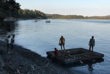
We arrived 'down the isle' as it were on the very rowboats that inspired us to build a rowing station on our back to back suntrip trike:

But it was our common interest in unicycling and not boating that caused us to meet some 10 years ago. Anyways, I happened to still have a whole bunch of chemicals left over at my family property in Sooke from back when I thought pyrotechnics rather than ebikes was my life's calling. I'd been hanging onto them for some event or other and this was the perfect occasion to do one last hoorah.
In the weeks leading up preparation me and several friends were mixing up chemicals, ramming rockets and fountains, pressing stars, forming fuses, building a dock to do an aquatic pyro show. That bit Anne-Sophie knew about, but we managed to keep the detail a close surprise. Once the main fuse was lit, a giant 8 foot unicycle lit up on the water in blue lancework and then thrusters on the pedals set the whole wheel in spinning motion!
View attachment 3
So thanks once again to everyone who wished us well. We survived the pre-honeymoon adventure stronger and more certain as a couple for sure, and had a good 2 weeks after the wedding to spend with family and friends.

Now after some needed radio silence we're back to full time life in Vancouver.
Attachments
StuRat said:What happened to the bike??
The trike, as of today, is back at our shop in Vancouver!
With the help of Ali at ebikebc.com and the people at the research institute in Tehran it got crated up last week and shipped cargo to the Vancouver Airport. So that really wraps everything up without loose ends. There was only a little fuss clearing customs but when we showed them Instagram pictures of the trip it was obvious we were getting a personal bike back and not importing anything nefarious.

I haven't unboxed any of the parts or started the process of putting it back together again, but before doing that there would need to be some serious examination and tuneups.
At the time we arrived in Tehran I was pleasantly impressed that almost everything mechanical about the trike held up for the entire trip. The replacement no-name china freewheel for the rowing system that we got in Croatia survived right to the end; the experimental string/pulley rowing rig performed solidly the whole journey, and after some repairs on the ferry in turkey our rolling tilt solar roof system worked great for on-the-fly angle adjustments without us loosing a beat. Zero problems with the hub motors, motor controllers, MPPT charge controllers, or solar panels. I had LOTS of problems with the consumer electronics (3 broken cell phones and one failed tablet) but that's because I'm jinxed with those things.
However, we noticed in the last days that the roof structure seemed more wobbly than normal. It was only when we were dismantling the trike to pack it up in boxes that I noticed the reason. The front rowing frame which was made with the thin walled aluminum tubing was completely cracked on 3 sides of each tube, leaving only the inside face of the square tubing fully in tact.

We accidentally flipped the trike on it's side a 2nd time on one of our last days riding when we went diagonally up a steep curb. I think it's that crash that caused the crack to go so deep but the fatigue failing was certainly well underway. It's likely that this would have broken off completely within a couple days if we continued riding.
I was nervous from the start about using this thinner walled (~1/16") square tubing over the thicker ~1/8" wall thickness material that we used on the rear frame tubes, and for good reason it would seem. On closer examination, we can see that even a lot of the welds between the steel plate and the cromoly frame tubes are cracking as well.

If we had set out to continue all the way to china we'd for sure have been hitting up welding shops along the way for some major structural repairs, as did a large number of the other teams.
usertogo said:What interests most is for example that mysterious wrong road, that long time second place Bertrand Stephan took in China which cost him many positions and who knows what else...
In this case, that had everything to do with internal politics in China and nothing with road conditions or dead ends etc. This part of China (Xinjiang province) is nominally closed to tourists and has become in recent years the most vivid example of a surveillance/police state that you could imagine (see https://www.economist.com/briefing/2018/05/31/china-has-turned-xinjiang-into-a-police-state-like-no-other to get an idea). People on the Suntrip race had to check in with police at every town, get escorted to authorized hotels for the night etc.
I don't know the details of why, but Stephane was choosing to take a different road further south of the official authorized route, and for the first several days was able to talk his way through all the police checks and carry on. But then one at one point the police forbade him from continuing on that route and made him turn around and backtrack all the way back on the same road. It's pretty crappy and killed any chance of him catching up to the lead, but he sure seems to have taken it in stride.

I had done little exploration in Germany and my GPS would have made me take forest trails that could be given variable weather fully impossible or at least 'stuck in the fractal' and not making distance, but that a region exists that is so fully disconnected from major routes that one would have to backtrack a days worth of travel?
Just politics. But your point is correct that the route planning on a solar bike ride takes a lot more into consideration than blindly following a cycling app. The best roads for solar ebikes are usually the semi major roadways (wide shoulder and mostly clear from shaddow causing trees and buildings), but then you're taking a chance that bikes aren't allowed and you'll get fined and escorted off by the police.
I would like to propose that pro quick charging consciousness a new Solar Muscle Electric 'Tribrid' Race - with larger battery capacity and Quick Charge stops allowed - would be interesting!
Well, make the rules and organize the race and I'm sure you'll find a lot of people (including a number of Suntrippers, me included) keen to participate!
zro-1
1 kW
A HUGE congratulations to you and AnSo, Justin! I'm sure the light in your hearts out shone those (very impressive) fireworks you put together.
I'm so happy for you both and wish you the very best of times on your journey together. Thank you for making this little forum on the internet such a big part of your life. I think I can speak for all of us when I say that we all appreciate everything you've done for and with us here.
I'm so happy for you both and wish you the very best of times on your journey together. Thank you for making this little forum on the internet such a big part of your life. I think I can speak for all of us when I say that we all appreciate everything you've done for and with us here.
Thanks Zro-1. I'm glad to hear that you and others have been appreciating the time needed to share and document this stuff on the forum and am always happy seeing others do the same.
FWIW we just finished the edits for the 2nd trip video which gets us up to Serbia.
[youtube]idhKDZkmIFs[/youtube]
For those who missed out as things unfolded in real-time, it looks like we'll get to have the video clips coming out on like a 2-3 month delay loop so stay tuned for Bulgaria and Turkey next!
The fingers
10 TW
Congratulations on your wedding, you're off to a great start.
Cephalotus said:justin_le said:....
It'll take a lot of additional rework of this trip analyzer web app to present multi-day log files in a way that is easier to visualize since the graph data quickly gets quite noisy, but that's something we'll be working on over the summer so that by the time the race is done we'll be able to show and compare all the different solar ebike performances with this tool.
This would be fantastic!
I'm very interested in the performance of the vehicles and the solar arrays and sadly so very little data is available to the public from the first suntrips.
Well guys, long time since I've piped in here, but the 100 day time limit for the Suntrip race was reached a short while ago and the last of the suntrip riders have just crossed their way to the finish line in Guangzhou, certainly a little battered and tattered but amazing to see!
https://www.thesuntrip.com/francoise-denel-arrivee-suntrip2018/
At last we've started getting the log files from the other suntrip treams and as promised we made a huge number of changes to our trip analyzer software in order to deal with these super large files. For the data junkies, here is the complete data for our trip:
http://www.ebikes.ca/downloads/SuntripLogs/Justin_AnSo.zip
If you unzip this, you'll see there is a folder that has the logged data for each trip in DailyLogs. This is the raw 1Hz log data that's been parsed and split into 24 hr sections (as set by UTC+3) so that it's neatly organized into one file for each day. There's another folder for downsampled data which is the same thing but where we've decimated the data to either 0.1 or 0.2 Hz for smaller file size. And finally, there is a daily summary .csv file that has the statistics (total distance, average speed, wh/km, solar watt-hours etc) from each day.
View attachment 5
Each log file starts with a header that shows the columns. The first column, UTC, is now a universal unix date/time stamp, the 12 next columns are all the standard things you'd have from a CA3 device (amphours, volts, amps, speed, distance, temperature, rpm etc). Since these databoxes were stand alone devices and not the primary CA, there weren't any PAS, torque, temperature, or throttle sensors attached so much of this data is zero. And the final 7 columns are all new, containing the solar amps and Ah data, the GPS data (heading, elevation, latitude, and longitude) and finally flags that indicate the state of the GPS sensor.

Here's where things get fun. If you have the trip data downloaded on your computer, you can now navigate to the trip analyzer page here, click to upload CA data, and then control select ANY NUMBER of files that you want to look at and it will concatenate the data and show it in a single plot. The trip analyzer can handle upwards of 100 MB of logged data this way before causing the browser to crash. With the x5 downsampling, it takes a while to load but you can view our entire trip from Lyon to Tehran in a single graph.


Right now after uploading and processing it switches by default to showing a time axis view rather than distance axis, which makes a bit more sense in the context of solar watts. The default viewing shows the solar data in the extended data set, with the watts in pink and the accumulated solar watt-hours in green.

You can now see each daily sun cycle that we received and how much accumulated watt-hours we got from the rise of the green line. If you look closely at the graph, it contains both a dark line as well as a transparent shaded range. Since each pixel represents hundreds or thousands of data points, we have it so that the solid pixel is the average value and then the range of data that is averaged to produce that point is visible in the transparency.
This both helps the graph display much faster, and it makes it a lot less cluttered to see meaningful trends in noisy/fluctuating data like the solar output. Now when you are zoomed in and scroll left and right, it initially previews in the downsampled data to be responsive and render quickly, and then once you release the mouse button the data for that section reloads at a high resolution.

If anyone has tried using the trip analyzer previously with large data files, you'll know how bogged down and unresponsive it would get. These recent updates are a huge improvement that make it properly usable.
So now with these tools are in place, I'll be devoting my next posts to looking at interesting insights that this data has shown us about the performance of our own system, much of which wasn't at all apparent while we were actually riding on the trip!
So Here's one thing we noticed from the graphs that I didn't observe at all on the trip. Whenever there was a section of steady constant solar power, like when we were stopped and charging on a sunny day, there were still regular blips where the solar power would drop down by ~100 watts for a second and then recover.
You'll see this clearly if you load the Day27 log file from our trip data (attached .zip, or just use the link here ). Here we were in the cave hotel in the Cappadoccia region. We'd arrived the night previous with the battery almost completely empty (you'll see it starts the day at ~31.5 volts) and so decided let it charge up in the morning before heading out. (Meanwhile we gladly took our time enjoying another delicious Turkish breakfast.

At 6am the sun starts to rise but the solar output is pretty meek since we're in the shadow of a mountain. By ~7:30 the sun is fully on the panels and we're getting significant charge. It should be a perfectly smooth graph, but there's these rhythmic drops that are apparent. When we zoom in on it, we see that it's like clockworks at an interval just shy of 5 minutes.

Our setup has two independent solar arrays, with 400 nominal watts of panel going into a chinese MPPT device, and then the extra 150 watt panels using a Genasun charge controller. I was lazy and left the Chinese MPPT to a default 36V lead acid profile that had a full charge of 43.5V, which meant it would charge the LiGo's at full current right until the BMS tripped. However, the Genasun device was set from the factory to a 41.7V constant voltage, and in practice with the voltage drop along the cable leads we'd see power rollback when the pack was a little over 41 volts.
By 10:20 in the morning, the battery is mostly charged and Genasun MPPT switches to CV mode, and at this point the 5 minute blips stop completely. So we can only conclude that this is some peculiarity of the Genasun charge controllers when they are operating in steady sunlight in max power mode.
View attachment 3
On a similar note, if you zoom in even more closely you can see there there is also a regular undulation in the solar watts that seems to average around a 9 second period. The variation in this data is much smaller at ~3-4 watts, but I didn't notice this AT ALL in all the time I spent watching the solar power on my CA screen. If the last digit changed I probably brushed it off as noise, but when you see it graphed like this it's very clearly the maximum power tracking algorithm of the MPPT device in play, as it gradually hunts up and down to see that it's pulling the most power possible from the solar panel.
View attachment 4
These undulations were also present and at the same timing interval in the graph section where the Genasun device was out of play, so we can conclude it's the Chinese MPPT responsible for these pulses. It also means that there is a small but quantifiable amount of power lost by the MPPT unit when it is on either side of the peak. That's a lot of time spent when it's producing 3-4 watts less power than if it stayed on the peak the entire duration.
You'll see this clearly if you load the Day27 log file from our trip data (attached .zip, or just use the link here ). Here we were in the cave hotel in the Cappadoccia region. We'd arrived the night previous with the battery almost completely empty (you'll see it starts the day at ~31.5 volts) and so decided let it charge up in the morning before heading out. (Meanwhile we gladly took our time enjoying another delicious Turkish breakfast.
At 6am the sun starts to rise but the solar output is pretty meek since we're in the shadow of a mountain. By ~7:30 the sun is fully on the panels and we're getting significant charge. It should be a perfectly smooth graph, but there's these rhythmic drops that are apparent. When we zoom in on it, we see that it's like clockworks at an interval just shy of 5 minutes.
Our setup has two independent solar arrays, with 400 nominal watts of panel going into a chinese MPPT device, and then the extra 150 watt panels using a Genasun charge controller. I was lazy and left the Chinese MPPT to a default 36V lead acid profile that had a full charge of 43.5V, which meant it would charge the LiGo's at full current right until the BMS tripped. However, the Genasun device was set from the factory to a 41.7V constant voltage, and in practice with the voltage drop along the cable leads we'd see power rollback when the pack was a little over 41 volts.
By 10:20 in the morning, the battery is mostly charged and Genasun MPPT switches to CV mode, and at this point the 5 minute blips stop completely. So we can only conclude that this is some peculiarity of the Genasun charge controllers when they are operating in steady sunlight in max power mode.
View attachment 3
On a similar note, if you zoom in even more closely you can see there there is also a regular undulation in the solar watts that seems to average around a 9 second period. The variation in this data is much smaller at ~3-4 watts, but I didn't notice this AT ALL in all the time I spent watching the solar power on my CA screen. If the last digit changed I probably brushed it off as noise, but when you see it graphed like this it's very clearly the maximum power tracking algorithm of the MPPT device in play, as it gradually hunts up and down to see that it's pulling the most power possible from the solar panel.
View attachment 4
These undulations were also present and at the same timing interval in the graph section where the Genasun device was out of play, so we can conclude it's the Chinese MPPT responsible for these pulses. It also means that there is a small but quantifiable amount of power lost by the MPPT unit when it is on either side of the peak. That's a lot of time spent when it's producing 3-4 watts less power than if it stayed on the peak the entire duration.
Attachments
Here is the summary statistics from each day.

The most solar charge that we ever got in a day was from that same day27 file in turkey that we just discussed, at nearly 3600 watt-hours, and that's including the fact that we were in the shade after sunrise and the allowed the batteries to become fully charged before we left. With a bit more attention this might have been a 3800 Watt-hour day!
Most decent days were in the 2500-3000 watt-hours, but what amazed me is that even in cloudy and rainy weather we still regularly got over 1kWhr of solar input. There was only a single day on the entire trip where we didn't quite reach that, with 985 watt-hours on the day we crossed from Croatia into Serbia.
Here is day 14, which was our worst in the entire trip (as measured by Solar Wh, it was actually pretty fun for other reasons). During the morning with clouds and light rain we were seeing ~50-80 watts. By noon there were some brief periods with the sun breaking through and we were able to take breaks and let the batteries get mostly charged up. But by the afternoon some really dark clouds came over and you can see the solar output dropping to near zero watts.

Day 16 is the 2nd worst with 1040 watt-hours. What you can appreciate here is that it was what anyone would call "cloudy" all day long, but during the day there are clouds that would allow ~250 watts of power into the panels, and there were clouds that would only let like 10-20 watts come through. Riding a solar ebike you developed a good sense for the relative opacity of a given cloud cover, and me and An'So got pretty good at the game of looking at the sky and guessing exactly how many solar watts we had coming in.
Towards the end of the full Suntrip race, the people riding through the last legs of china with spells of bad weather and ever reduced daylight would have died to get the 1kWhr of energy that we considered a "worst day" example.
Anyways over the entire trip we had an average 2200 watt-hours / day, exactly 4 times the nominal power of our solar roof (550 watts). That's with panels that could tilt left/right for better exposure, and riding in the summer months through a region that should be mostly fair weather. I'm very curious to see how that multiplier number looks with the other solar bikes and if it's fairly consistent or varies with the different setups, since it's basically the most useful rule-of-thumb stat when planning a solar touring trip.
The most solar charge that we ever got in a day was from that same day27 file in turkey that we just discussed, at nearly 3600 watt-hours, and that's including the fact that we were in the shade after sunrise and the allowed the batteries to become fully charged before we left. With a bit more attention this might have been a 3800 Watt-hour day!
Most decent days were in the 2500-3000 watt-hours, but what amazed me is that even in cloudy and rainy weather we still regularly got over 1kWhr of solar input. There was only a single day on the entire trip where we didn't quite reach that, with 985 watt-hours on the day we crossed from Croatia into Serbia.
Cephalotus said:Can you show data from a day with rainy or overcast weather, too if you find some time to do so?
Here is day 14, which was our worst in the entire trip (as measured by Solar Wh, it was actually pretty fun for other reasons). During the morning with clouds and light rain we were seeing ~50-80 watts. By noon there were some brief periods with the sun breaking through and we were able to take breaks and let the batteries get mostly charged up. But by the afternoon some really dark clouds came over and you can see the solar output dropping to near zero watts.
Day 16 is the 2nd worst with 1040 watt-hours. What you can appreciate here is that it was what anyone would call "cloudy" all day long, but during the day there are clouds that would allow ~250 watts of power into the panels, and there were clouds that would only let like 10-20 watts come through. Riding a solar ebike you developed a good sense for the relative opacity of a given cloud cover, and me and An'So got pretty good at the game of looking at the sky and guessing exactly how many solar watts we had coming in.
Towards the end of the full Suntrip race, the people riding through the last legs of china with spells of bad weather and ever reduced daylight would have died to get the 1kWhr of energy that we considered a "worst day" example.
Anyways over the entire trip we had an average 2200 watt-hours / day, exactly 4 times the nominal power of our solar roof (550 watts). That's with panels that could tilt left/right for better exposure, and riding in the summer months through a region that should be mostly fair weather. I'm very curious to see how that multiplier number looks with the other solar bikes and if it's fairly consistent or varies with the different setups, since it's basically the most useful rule-of-thumb stat when planning a solar touring trip.
solarEbike
100 W
Hey Justin. Thank you for dedicating so much of your time and Grin Tech resources to upgrading the Trip Analyzer and sharing your detailed analysis. The low rez/high rez approach and the shading are elegant solutions to working with large data sets in a browser app. I'll certainly be putting them to good use.
That's cool to see in the data. Genasun's marketing claims their "MPPT adapts immediately – 15 times per second" so I guess their algorithm hunting around the IV curve doesn't show up at the 1Hz sampling rate. The 5 minute blip may be a periodic full sweep of the entire IV curve to ensure it's not stuck at a local maximum? My understanding is that the specifics of these algorithms tend to be closely guarded secrets as the various PV inverter and charge controller vendors see them as a way to differentiate their products from the competition.
I'm curious, too, so I took a shot at it. Technical specs on the SunTrip bikes are hard to find (why?!)... you may have better numbers but here's what I've found:
Interesting that the two bikes with solar roofs appear to be producing about 30% more daily Wh per panel watt than the two bikes with lower mounted arrays. I find myself wondering how much of that might be self-shading losses? It would be nice to get more data.
I used your daily total solar Wh and km to try to validate the predictions of the solarEbike Trip Planner I posted last month. I applied a 15 day moving average to make it possible to compare with typical weather data at multiple locations along your route. I then adjusted the shading loss input value to match your daily production to see if the results looked reasonable.

This chart makes it looks like Turkey and Iran get a lot more sun in July than Europe does in June but according to the weather data (using a "typical meteorological year"), it's usually only 11% more. It's possible that June 2018 was more rainy than a typical June but I can't check right now because I don't have weather data for individual years.
From Lyon to Istanbul, the shading loss input value would need to be 45-50% to match the modeled daily solar Wh to your actual daily Wh. This seems high to me. I wondered if (in addition to extra rain) it could be due to the solar energy that wasn't captured due to late morning starts and extended stops during the day when the energy coming form the sun couldn't be captured because the charge controllers were in CV mode. I looked for sustained high voltage plateaus in your data but didn't see many.
From Istanbul to Ramsar, the average shading losses would have to be 22-33% to match the predicted daily solar Wh. This is much closer to my expectations based on my test rides and years of residential PV production modeling.
I think the lesson here is to assume at least 20-40% for overall system losses due to shading and system availability when comparing against PVWatts results which are intended to model stationary PV installations designed to harvest every possible Wh.
justin_le said:By 10:20 in the morning, the battery is mostly charged and Genasun MPPT switches to CV mode, and at this point the 5 minute blips stop completely. So we can only conclude that this is some peculiarity of the Genasun charge controllers when they are operating in steady sunlight in max power mode.
That's cool to see in the data. Genasun's marketing claims their "MPPT adapts immediately – 15 times per second" so I guess their algorithm hunting around the IV curve doesn't show up at the 1Hz sampling rate. The 5 minute blip may be a periodic full sweep of the entire IV curve to ensure it's not stuck at a local maximum? My understanding is that the specifics of these algorithms tend to be closely guarded secrets as the various PV inverter and charge controller vendors see them as a way to differentiate their products from the competition.
justin_le said:Anyways over the entire trip we had an average 2200 watt-hours / day, exactly 4 times the nominal power of our solar roof (550 watts). That's with panels that could tilt left/right for better exposure, and riding in the summer months through a region that should be mostly fair weather. I'm very curious to see how that multiplier number looks with the other solar bikes and if it's fairly consistent or varies with the different setups, since it's basically the most useful rule-of-thumb stat when planning a solar touring trip.
I'm curious, too, so I took a shot at it. Technical specs on the SunTrip bikes are hard to find (why?!)... you may have better numbers but here's what I've found:
- Bernard and Yann averaged 2080 Wh/day with a 517 watt array (my estimate based on 150 cells at 3.63 watts per bare cell minus 5% for encapsulation losses) so 4x
- Jack Butler averaged 906 Wh/day with a 300 watt array (assuming 4 panels @ 75w each as indicated here) so 3x
- Eric Morel averaged 1137 Wh/day with a 370 watt array (my estimate based on 108 cells, assuming high-efficiency SunPower cells) so about 3x
Interesting that the two bikes with solar roofs appear to be producing about 30% more daily Wh per panel watt than the two bikes with lower mounted arrays. I find myself wondering how much of that might be self-shading losses? It would be nice to get more data.
I used your daily total solar Wh and km to try to validate the predictions of the solarEbike Trip Planner I posted last month. I applied a 15 day moving average to make it possible to compare with typical weather data at multiple locations along your route. I then adjusted the shading loss input value to match your daily production to see if the results looked reasonable.
This chart makes it looks like Turkey and Iran get a lot more sun in July than Europe does in June but according to the weather data (using a "typical meteorological year"), it's usually only 11% more. It's possible that June 2018 was more rainy than a typical June but I can't check right now because I don't have weather data for individual years.
From Lyon to Istanbul, the shading loss input value would need to be 45-50% to match the modeled daily solar Wh to your actual daily Wh. This seems high to me. I wondered if (in addition to extra rain) it could be due to the solar energy that wasn't captured due to late morning starts and extended stops during the day when the energy coming form the sun couldn't be captured because the charge controllers were in CV mode. I looked for sustained high voltage plateaus in your data but didn't see many.
From Istanbul to Ramsar, the average shading losses would have to be 22-33% to match the predicted daily solar Wh. This is much closer to my expectations based on my test rides and years of residential PV production modeling.
I think the lesson here is to assume at least 20-40% for overall system losses due to shading and system availability when comparing against PVWatts results which are intended to model stationary PV installations designed to harvest every possible Wh.
tomjasz
1 GW
What a great fantasy trip for this old gimp. Full of great stories, humanity and data. As wheel as a gorgeous bride.
All the best.
T
All the best.
T
solarEbike said:Hey Justin. Thank you for dedicating so much of your time and Grin Tech resources to upgrading the Trip Analyzer and sharing your detailed analysis. The low rez/high rez approach and the shading are elegant solutions to working with large data sets in a browser app. I'll certainly be putting them to good use.
I can't wait to see what you'll be able to do with this tool Mark, especially for comparing your detailed modeling predictions with empirical test results.
justin_le said:By 10:20 in the morning, the battery is mostly charged and Genasun MPPT switches to CV mode, and at this point the 5 minute blips stop completely.
That's cool to see in the data. Genasun's marketing claims their "MPPT adapts immediately – 15 times per second" so I guess their algorithm hunting around the IV curve doesn't show up at the 1Hz sampling rate. The 5 minute blip may be a periodic full sweep of the entire IV curve to ensure it's not stuck at a local maximum?
I think it's something like that. We don't see this same 5 minute blip pattern when there is lots of fluctuation in solar input either, only in times when the solar watts are flat and steady. So it's like the MPPT is needing to do an occasional 'slap in the face' to see that it's really doing the right thing when it's otherwise been mostly invariant.
I'm curious, too, so I took a shot at it. Technical specs on the SunTrip bikes are hard to find (why?!)...
I've been promised a copy of the technical review document that was done on all the teams which has both the panel area and nominal watts, so we'll have this information soon. And hopefully the log data from many more teams as well.
you may have better numbers but here's what I've found:
Interesting that the two bikes with solar roofs appear to be producing about 30% more daily Wh per panel watt than the two bikes with lower mounted arrays. I find myself wondering how much of that might be self-shading losses? It would be nice to get more data.
- Bernard and Yann - 4x
- Jack Butler - 3x
- Eric Morel - 3x
There is another possible factor at play here, which is that both me&AnSo and Bernard&Yann only did the first month, when the days were longer and weather was theoretically better. Both Jack and Eric made it all the way to Guangzhou finishing much later in the summer which could have brought down their averages.
In any case this will be a fascinating thing to compare when we have a larger dataset, the solar roof vs solar front/trailer.
If you look at the actual log data, we have a column in there for the travel direction, and that was put in partly so that we could also do comparisons tilting vs level panels as a function of heading and time of day. We'd be able to calculate the theoretical left/right sun angle at each moment of travel, and see how much better tilting roofs were able to capture this. It's another thing that would be neat to compare with your modelling predictions.
I applied a 15 day moving average to make it possible to compare with typical weather data
We had a friend who's involved in tracking migratory animals recently share us this program here
https://www.movebank.org/node/6607
which would let you extract the actual weather info for an location at any time in the past, instead of using 'typical' data. I haven't looked into it in any detail but if we could upload the GPS data for a trip and get back a set of cloud cover, wind speed and direction data for each point, that would be amazing.
I think the lesson here is to assume at least 20-40% for overall system losses due to shading and system availability when comparing against PVWatts results which are intended to model stationary PV installations
That sounds about right. There were times when it felt like we were constantly fighting with shadows from trees, mountains, and buildings along the way, but also very large swaths of road where there wasn't anything blocking the light path and we should have matched a stationary install. There were also times we lost out on solar Wh by letting the batteries get fully charge while on a meal break or border lineup, or having the trike in morning shade by mistake.
Here's another thing that we can see and quantify from the log data, and that is the increased solar output we get on the panels from the cooling effect of passing air as we're riding. When you stop to take a break, you get some advantage that you can then perfectly orient the panels towards the sun. But it also allows the panels to get warmer than if you kept riding, and warmer solar panels have a less voltage and hence less power output.
Here's an example from a quick gas station stop. At first we orient orient the trike more ideally to be perpendicular to the sun direction and that immediately increases our power from ~360 watts to 378 watts. But then over the next 5-6 minute the goes back down to 357 watts as the roof heats up.

Here's another example where we stopped just for 5 minutes, and the solar power went from 313W to 300W.
View attachment 1
These aren't huge numbers but they are noticeable. Looking at some random examples I can find in our log data the solar output seems to drop by about 5% within 5-10 minutes of stopping. A fun theoretical question is whether the energy needed to actively cool the panel would be more or less than the energy gained from increased output.
Not that you want to spend too much time on your solar ebike trip stopped. But if you are stopped, is it worth running some small fans to keep the solar cells cool? Looking at these numbers I'd say probably not.
Here's an example from a quick gas station stop. At first we orient orient the trike more ideally to be perpendicular to the sun direction and that immediately increases our power from ~360 watts to 378 watts. But then over the next 5-6 minute the goes back down to 357 watts as the roof heats up.
Here's another example where we stopped just for 5 minutes, and the solar power went from 313W to 300W.
View attachment 1
These aren't huge numbers but they are noticeable. Looking at some random examples I can find in our log data the solar output seems to drop by about 5% within 5-10 minutes of stopping. A fun theoretical question is whether the energy needed to actively cool the panel would be more or less than the energy gained from increased output.
Not that you want to spend too much time on your solar ebike trip stopped. But if you are stopped, is it worth running some small fans to keep the solar cells cool? Looking at these numbers I'd say probably not.
solarEbike
100 W
justin_le said:These aren't huge numbers but they are noticeable. Looking at some random examples I can find in our log data the solar output seems to drop by about 5% within 5-10 minutes of stopping. A fun theoretical question is whether the energy needed to actively cool the panel would be more or less than the energy gained from increased output.
This is consistent with my findings. It's good to see this in the empirical data. The thermal coefficient of power for Gen II SunPower cells is -0.35%/ºC so a 5% drop would correlate to a 14°C rise in cell temperature. In full sun with no airflow, cell temperature rise is typically 25-30°C above ambient so theoretically you could gain up to 10% if you could get the cell temperature down to ambient air temp. That doesn't sounds realistic with just fans and/or heat sinks but it does explain why you may notice a gradual 10% drop in power when you emerge from a cool garage directly into full sun.
In my modeled solar output, I initially failed to account for increased airflow over the solar panels from the travel speed of the bicycle. Anecdotally, I would see these drops in power when I stop but I didn't have enough logged data to quantify the effect. I looked at how wind speed in the weather data was used to calculate PV cell temperature (here's a paper on it). I found that at bicycle speeds, the power gain from increased airflow over the solar panels peaks at 5-7% but the annual average is in the range of 1-3%. I now use a 2% adder in my model when the bicycle is moving.
For anyone considering active or passive solar cell cooling solutions which will add weight and complexity to your project, keep in mind that you will not get 5% more Wh per day. The peak gains only apply when plane of array (POA) irradiance is around 1000 W/m^2 (cloudless conditions, solar noon +/- ~3 hrs). Earlier and later in the day and whenever there's any cloud cover and any time your panel isn't oriented perfectly you're getting less. Even on very sunny days, a significant portion of your daily Wh are accumulated under these conditions.
Solar cell temperature is a function of irradiance. At 500 w/m^2 (very bright overcast conditions or poor solar panel orientation) your cells are only heated half as many degrees over ambient air temperature meaning that your 5% cooling gain becomes a 2.5% gain. If you were getting 10 extra watts in full sun from your 200 watt panel, you will only get 2.5 extra watts at half sun (2.5% of 100 watts).
solarEbike
100 W
justin_le said:We had a friend who's involved in tracking migratory animals recently share us this program hereI applied a 15 day moving average to make it possible to compare with typical weather data
https://www.movebank.org/node/6607 which would let you extract the actual weather info for an location at any time in the past, instead of using 'typical' data. I haven't looked into it in any detail but if we could upload the GPS data for a trip and get back a set of cloud cover, wind speed and direction data for each point, that would be amazing.
Somebody else is interested in weather data along a path and they're creating tools to do that? Cool.
Typical meteorological year (TMY) data is a good choice for modeling average output of a system over 10, 20, 30+ years or predicting average daily Wh for Ushuaia in January. When analyzing trip logs, actual weather data for the same dates would be a better choice. Unfortunately, the PVWatts API I'm using for my modeling tool does not have an option for using custom weather data files.
Converting weather data into solar output watts can be done with other tools, or even from scratch by deriving cell temperature and irradiance from weather data, but it's not trivial. For example, most weather data sources do not include physical measurements of direct and diffuse irradiance so they need to be extrapolated from other measurements. There are companies like SolarAnywhere who specialize in this but they're focused on small niches with big budgets like utility-scale solar installations. They even do some short-term solar forecasting to help with stuff like utility grid load balancing.
My current efforts were mostly low hanging fruit for me. The goal was to get a ballpark figure of average daily Wh for an arbitrary date range for any location to help with route planning. Log analysis using custom weather data may be a project to tackle down the road when I have some down time. Hey, maybe I could add some sensors to my bike to measure ambient temp, wind speed, irradiance... the Analogger has input pads for a thermistor!... then again, feature creep already has me months behind schedule so maybe not.
gothicsurf
10 mW
Would the use of peltiers in this case be of benefit? The cool side on the elements that need cooling, the warm side mounted with heat sinks and exposed to the passing air.
And where does the power to run the peltiers come from?
gothicsurf
10 mW
a disparity in temperatures as in the case of an overheating motor and passing air of ambient temperature, a peltier will generate electrical polarity: seebeck effect.
Cephalotus
10 kW
- Joined
- Jun 18, 2012
- Messages
- 755
There must be an abundance of data form all those data Loggers.
Is this data available or does/did someone make a summary?
I would be interested in the following information for each vehicle and each day:
- Daily time riding on bike in hours
- Distance driven per day in km
- Time while bike is in charging mode (not driving) in hours
- Solar energy produced (Wh/day)
- Motor energy consumption (Wh/day)
- other energy consumption (Wh/day)
- Battery SOC at beginning of each day in Wh or % + battery SOC at the end of trip.
- (if available: Human energy pedalled in Wh/day)
This would be great to compare different vehicles and concepts and "race" strategies.
Cephalotus said:There must be an abundance of data form all those data Loggers.
There IS an abundance of data, but just a shortage of time. I has one of our software co-op students working on parsing and organizing much of it (and also fixing/correcting a bunch of corruption that managed to make it into a lot of the data streams) but we didn't get to the final stage of organizing it before the term ended at the end of December.
With people deep in preparation for the 2019 event though there should be some extra motivation to get this out there soon so I will do my best!
solarEbike
100 W
Cephalotus said:There must be an abundance of data form all those data Loggers.
I was interested in exploring the data to see what guidance it may contain for selecting solar panel size and tilting vs. non-tilting mounting design choices for casual solar bike touring. Here's what I found:
I excluded two riders who suffered major solar panel losses along the way and used solar watts per rider to allow (an imperfect) comparison of single riders and tandems. The linear trend line is a surprisingly close fit. You can pick your target daily distance and use the line to tell you what size solar panel you need or use it to predict your daily distance for a given solar panel size.
The 440 watt outlier is Stéphane Bertrand, who came in 4th place. I speculate that the lower-than-predicted daily distance is due to his below-average ratio of solar watt-hours to solar watts (3.3) and above average energy consumption of 7.5 Wh/km at a high average speed of 26.1 kph.
The 270 watt outlier is the tandem team of Bernard and Yann Cauquil with a 540 watt array on their tandem. The higher-than-predicted daily distance can be attributed to the best-in-class solar Wh/W ratio (3.9) and below-average 5.9 Wh/km per rider at an average speed of 23.9 kph.
Human Wh were not recorded so it's difficult to account for the pedaling contributions of stronger vs. weaker riders. More or less efficient vehicle designs, route selection, etc. also surely play a role but solar panel size appears to be a solid predictor of average daily distance.
Next, what is the best strategy for getting the most watt-hours from your solar panel? Four of the top five in this group used panel mounting strategies which allowed them to ride with the panel tilted. They averaged 3.7 Wh per day for each solar watt. The rest had panels which were always horizontal when riding and they averaged 3.3 Wh per watt. The average gain from riding with a tilted panel was 13%.

Bernard Cauquil posted an analysis (original French, translated to English via Google) using data from a single day and concluded the gain was only 9%. I agree with his recommendation that it is far simpler to add 10% more solar panels and avoid the complexity of tilting mounts for summer touring. In winter, the gains from a tilt (manual or automatic) would be much higher.
I also looked for a pattern to quantify the advantage of a roof mounted solar panels versus trailers and other lower mounts which are subject to self-shading early and late in the day. I found no such correlation here. Some of the lowest Wh/W ratios were for roof panels whereas 7 out of the top 10 Sun Trip finishers used designs with some amount of self-shading.
I shared my spreadsheet with all the daily data. Anyone can download it in Excel or OpenDocument format using File > Download. If you log in with a Google account, you can also use File > Make a copy to save your own copy which can then be edited in the browser to do your own analysis. The data files prepared by Grin Tech are here.