Hey all, we made a number of enhancements to the CA analysis software a few months ago which we hope makes it both more intuitive to use, and more useful too.
http://www.ebikes.ca/tools/trip-analyzer.html
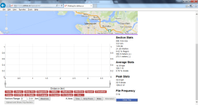
Instead of the cursor point stats being located on top of the graph with the button selection icons on the bottom, we've now got it consolidated so that the data for each plot line is shown right on the plotline legend, along with a checkbox to indicate whether the selected plot is shown or not, and all the data for the cursor will show up whether the graph is plotted or not.

And now, rather than having the extended CA3 data showing on the same graph, we've broken that out onto a 2nd graph underneath the primary plot. In order to make this a bit more universal too, the dataset here isn't confined to just being the human watts, torque, RPM, throttle in, throttle out etc. You can rename any of the fields and also copy and past data from any other sensors that are logged at the same rate in the CALog file before uploading it, and then view that data in the plot too. You can choose whether a particular plot is scaled on the left or the right axis, and also whether to show average and peak statistics over the selection for that data set.

When you upload and save the trip, it should remember all of these customized view settings so that anyone else who gets the share URL link will see the data presented in the same way. This of course changed the format of the uploaded trip files, but we've run a conversion so that links to any previously uploaded trip files should still work and show in the new format.
If there's more feedback that'd be great. I still want to add an additional option to show data scatterplots, of say power and speed vs %grade. But for now this seems to have covered most bases.