The video was indeed helpful.
I love being able to put what cells I want to see, and compare their voltage curves both the initial sag, and where they cross the 3.0v line, and being able to zoom in, and see the numbers and toggle cells on and off. Very useful, and very interesting.
I am well aware that tiny differences in performance likely cannot be felt, but I love seeing the minute details how cells perform when new, and how they compare to other cells with all other factors being equal.
The line below 3v is useful for me only as it shows how nominal capacity is almost a useless figure, and trying to compare cells by their nominal ratings is a fool's errand.
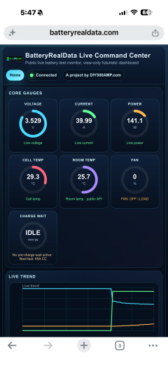
On the live page, on the 'live trend' window being able to zoom out and see the whole of the charge and discharge as it is happening would be much more interesting than being so closely zoomed in.
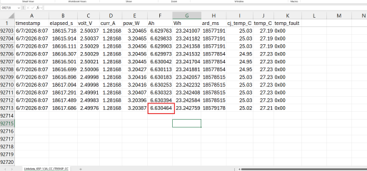
I like seeing what the last test was and the AH/WH delivered, and max temperature, and it would be cool to see what the next test will be. Like right now you are charging the P42A at 1C, and the last test it delivered 3.89Ah at 25 amps and got to 75.87C doing so, but will the next test be 30 amps, or 20 amps?
Also if room temperature is 25C, was the cell also 25C when discharge began, or 26.1C with some residual heat from charging left over?
Viewers might not know about the 600 second rest after charging, or discharging, before current is allowed to flow again.
If in the rest period, a countdown to next charge/ discharge would be neat to see.
I'd probably have the fan running during charging as well, but I can see why you do not do so as the cell has those 600 seconds to return towards room temperature, but if the cell has not returned to room temperature then there is some 'not equal' factors mixed in which might muddy the results.
It would also be neat in the future if you could retest a used cell, and be able to compare the line charts a cycle 3 vs cycle 250, or even just a '6 months of use/ number of cycles/ and depth of those cycles unknown'



Are you still selling cells?