Xenforo conversion thread ( ES 2.0 )

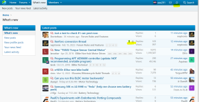
Although of less importance, I observe that the nationality of a member is no longer visible in the profile.
I found this especially useful if the question relates to local webshops or legal regulations, because, for example the difference between US and EU rules. Or if used Google translate.
 
I am sorry but wtf happened here, my eyes hurt from this new "design". Why change what is good and especially to something 10 times worse?
Can you be a little more specific on why you think it's bad?

I've heard 1 person complain about it being too bright, and i have made adjustments since to darken it a tad.

You can use the default Xenforo style that is a little darker if it's too bright for you.

1677611162814.png
 
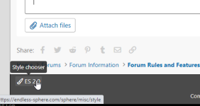
Is there a way to add some additional styles? There are two to choose from now.

Yes.
I looked for aftermarket themes for Xenforo and didn't find any that:

1) were sufficiently compact.
2) were particularly good looking.
3) departed from Xenforo's default color overload/superfluous element overload.

We can definitely drop $50 on an alternate theme, preferably a dark one for people who prefer that.
But i don't have anything in mind.
 
I poked at the last-reply issue and found that any thread created after the conversion seems to operate as you found, where the thread title link (at the left) in a list of threads (watched, new, etc) takes me to the first unread post, and the date/time link (at the right) takes me to the last post.

Threads created before the conversion seem to mostly operate as I had previously observed. Once (but only once, and I've already forgotten which thread it was) it operated as you had observed instead. Then I ran out of unread posts made since the conversion, so I can't test this any further myself. (any reply made before the conversion operates as I had observed originally, of the many I tested (dozens?...lost track)).

I'm glad it's working better.
Xenforo did not import read/unread states at all and that explains why the behavior on pre-conversion changed.

I expect this behavior to fully settle for everyone after a month of use due to new read/unread data being gradually written.
 
I'm not getting notifications from threads that I watch unless I post in them, I think.
So I'm gonna post here to see if I'll get notified.

I also like the old forum way more, I don't want to discuss or argue, so I won't say more about it.
 

Attachments

  • 1677613356570.png
    1677613356570.png
    328.7 KB · Views: 2
Can you be a little more specific on why you think it's bad?

I've heard 1 person complain about it being too bright, and i have made adjustments since to darken it a tad.

You can use the default Xenforo style that is a little darker if it's too bright for you.

View attachment 330790

Ok I realized another forum I follow also has this backed, and their theme is so much better (one of my favorites).


I use their blue theme and it is perfect for me.

Current one is an eyesore, font is like too sharp, theme is aggressive (bright?)
 
Last edited:
Ok I realized another forum I follow also has this backed, and their theme is so much better (one of my favorites).

Hmm, not a fan, but beauty is in the eye of the beholder.

The best of dark themes i saw were here:
Browse XenForo Themes - XenFocus
All of them would require a lot of tuning to get to a reasonably dense look.

I use their blue theme and it is perfect for me.

Current one is an eyesore, font is like to sharp, theme is aggressive (bright?)

Thanks for clarifying.

I agree about the font sharpness. It's too thin.
I have noticed the 'too bright' problem on my ultra bright gaming monitor at home.
After my first tune, it now looks okay on that monitor but maybe your screen is a different situation.

ES 1.0 had more contrast on things, some big borders, and very little rounded corners.
Xenforo has a lot of low contrast / way too high contrast situations, a lot of excessive spacing, and some excessive elements.
The theme you see is sort of a middle point between what Xenforo usually looks like and what ES 1.0 looked like.

I'm thinking that another 10% contrast and a font change should remedy the 'too bright' problem for some people and i'll give it a stab on the next round along with a font change.

PS, are you on a mac, linux, or windows pc... or.. a mobile phone?
 
pps:
Is the view of a thread significantly less of a brightness attack for you vs the front page with the list of categories, and the list of threads?
 
Hi Neptronix,

Generally like the new style. Works pretty well for me, I am relatively indifferent to the colour scheme and the font narrowness, I can read it fine. Nice work. I have only one request/suggestion...

Can we increase the information density some more please? I know I went on about this before, but it still bugs me a bit. I see you got rid of your sig, and I found the "don't show people's signatures" option (which is a shame to have to use in some ways, it's a nuclear option that hides civilised signatures linking to interesting stuff...) so that is a good improvement, but I still find everything kind of spread out.

The other thing missing is sending photos in private messages. Is this intentional? Would kind of make sense if it was.

Edit: on reflection and from the mobile app it's pretty good now. Desktop is a bit empty to the sides (wide-screen plague) and tight top to bottom, but tbh there's not much improvement to be had.
 
Last edited:
Hi Neptronix,
The other thing missing is sending photos in private messages. Is this intentional? Would kind of make sense if it was.
Unless it's a permissions problem, you should be able to attach files (including photos) in PMs (called Conversations in XF). I've already sent a PM previously here on XF that had a screenshot attached, successfully.


Regarding the way XF looks, well, I havent' said much because I already know the level of customization I really need for it just isn't going to happen; I do what I can within my browser and like some of the previous ES version(s) I live with the rest as best I can.

The PHPBB version I used the "zoom" function of the browser to make the font more readable and thicker, but I can't do that in XF because it screws up the rest of the page and makes everything huge, not just text. :( So I just squint a lot and don't read nearly as much of ES as I used to. Eventually I'll probably find something that I can use to make it better at my end without wasting everyone else's time trying to deal with my problems seeing it.
 
Last edited:
BTW, another issue with search that makes it less useful than the PHPBB version is that just like with threads, you can't search within your search to refine your results (you have to start over and put your refinements into the original search, which just like PHBB doesn't always work; it may cause it to not find any results depending on exactly what you put in. )
 
Hi Neptronix,

Unless it's a permissions problem, you should be able to attach files (including photos) in PMs (called Conversations in XF). I've already sent a PM previously here on XF that had a screenshot attached, successfully.


Regarding the way XF looks, well, I havent' said much because I already know the level of customization I really need for it just isn't going to happen; I do what I can within my browser and like some of the previous ES version(s) I live with the rest as best I can.

The PHPBB version I used the "zoom" function of the browser to make the font more readable and thicker, but I can't do that in XF because it screws up the rest of the page and makes everything huge, not just text. :( So I just squint a lot and don't read nearly as much of ES as I used to. Eventually I'll probably find something that I can use to make it better at my end without wasting everyone else's time trying to deal with my problems seeing it.
Yeah, permissions issue. I can attach files to threads but not to private messages. Maybe this is intentional to avoid es becoming a defacto email server
 
Hmm, not a fan, but beauty is in the eye of the beholder.

The best of dark themes i saw were here:
Browse XenForo Themes - XenFocus
All of them would require a lot of tuning to get to a reasonably dense look.


Thanks for clarifying.

I agree about the font sharpness. It's too thin.
I have noticed the 'too bright' problem on my ultra bright gaming monitor at home.
After my first tune, it now looks okay on that monitor but maybe your screen is a different situation.

ES 1.0 had more contrast on things, some big borders, and very little rounded corners.
Xenforo has a lot of low contrast / way too high contrast situations, a lot of excessive spacing, and some excessive elements.
The theme you see is sort of a middle point between what Xenforo usually looks like and what ES 1.0 looked like.

I'm thinking that another 10% contrast and a font change should remedy the 'too bright' problem for some people and i'll give it a stab on the next round along with a font change.

PS, are you on a mac, linux, or windows pc... or.. a mobile phone?


I am on windows and a VA gaming monitor on moderately low to mid brightness level.

Home page looks better yeah
 
I am on windows and a VA gaming monitor on moderately low to mid brightness level.

Home page looks better yeah

Interesting, VA does different things to colors and has significant variability due to the angle you view it at.
Over here i have two 27" Dell IPS 'ultrasharp' monitors which are aimed at the most accurate color output you can get.

Overall, ES 2.0 is about 10-20% brighter than it's predecessor depending on the screen, the reason is not so much the colors, but the amount of space that is white. In some LCD monitors, that white can bleed through to the darks, and particularly make thin text look thinner.

Give me a few weeks and i'll roll out a 'darkening' patch for the design.

Yeah, permissions issue. I can attach files to threads but not to private messages. Maybe this is intentional to avoid es becoming a defacto email server

It looks like this is off turned by default in Xenforo.
I've enabled it because storage is less of an issue than previously thanks to the image processor i wrote for ES ( cuts our storage needs down 60% ).

BTW, another issue with search that makes it less useful than the PHPBB version is that just like with threads, you can't search within your search to refine your results (you have to start over and put your refinements into the original search, which just like PHBB doesn't always work; it may cause it to not find any results depending on exactly what you put in. )

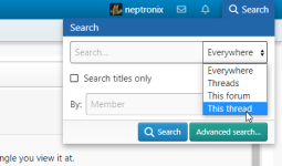
Okay i had to look this up.
Apparently we have this feature, it's just not obvious as to where it is.

2023-03-01 12_41_27-Xenforo conversion thread _ Page 5 _ Endless Sphere.png

In general i don't like the menus at all.. the entire thing needs to be rethought so that we lower the learning curve and increase the ease of use/cleanness.. that's also on the list!
 
The PHPBB version I used the "zoom" function of the browser to make the font more readable and thicker, but I can't do that in XF because it screws up the rest of the page and makes everything huge, not just text. :( So I just squint a lot and don't read nearly as much of ES as I used to. Eventually I'll probably find something that I can use to make it better at my end without wasting everyone else's time trying to deal with my problems seeing it.

I'm happy to build you a super high visibility edition once the color tuning of the existing theme is finished.
 
Interesting, VA does different things to colors and has significant variability due to the angle you view it at.
Over here i have two 27" Dell IPS 'ultrasharp' monitors which are aimed at the most accurate color output you can get.
Something to consider when doing UI color/brightness stuff (which I learned doing audio mixing, but found it applies visually when I started doing 3D and 2D computer art stuff): it can help get results "everyone else" will like to use "average" output devices (more than one, each with different characteristics, if possible) to do a check on.

For instance, when I'm audio mixing, I use my (ancient) Acoustic Research Powered Partner 77's, or some (new) AKG K240studio headphones, which gives me a pretty "flat" output to base decisions on. But I also listen to the mix on a Vizio soundbar, and a crappy Dell computer-monitor speaker bar, and an ancient android tablet, to try to make sure it's listenable on various types and sizes of speakers that are similar enough to what most people would have so I am not wondering why they think it's a crappy mix when it sounds perfect on my system. :lol:

Back when I still did visual art stuff, I used to do a similar thing with rendered-out-video from 3D modelling of scenes, to be sure they werent' too dark, or contrast too poor, etc, on different TVs and computer monitors.


Okay i had to look this up.
Apparently we have this feature, it's just not obvious as to where it is.

View attachment 330840
Thanks--I never even noticed the dropdown. It does help within a thread, which is very good, but it is not available within a search (including the results of using it on a thread), so you can still only narrow down things by starting over. If there is any way to force this to work on any place a search can be done, that would be very helpful. ;)
 
Interesting, VA does different things to colors and has significant variability due to the angle you view it at.
Over here i have two 27" Dell IPS 'ultrasharp' monitors which are aimed at the most accurate color output you can get.

Overall, ES 2.0 is about 10-20% brighter than it's predecessor depending on the screen, the reason is not so much the colors, but the amount of space that is white. In some LCD monitors, that white can bleed through to the darks, and particularly make thin text look thinner.

Give me a few weeks and i'll roll out a 'darkening' patch for the design.
Awesome, cool to hear!

Btw I have the highest end quantum dot va panel with great colors and viewing angles, also I only look at it from dead centre (1000r curve).
 
Neptronics,

From a quite new iPad: after attaching a photo below what text I have written for a new post I cannot get the cursor to fix [become visible] below the just inserted photo so as to continue writing text below the photo.

I have resorted to starting a new post to continue what I wanted to include in the text below the 1 picture post.

Any ideas how to continue with writing below the newly attached photo?
 
Any ideas how to continue with writing below the newly attached photo?
Sometimes I have had to kludge it by toggling into BB code mode to manually insert a return there before it will accept my typing. Then toggle off the BB code and it works as expected.

The toggle BB code button is at the upper right of the reply box, it's the two closed square brackets.
 
Sorry if I am missing something totally obvious, but is there a way to preview a post before hitting Post reply?
 
99t4,

Thanks ..i will try your suggestion here and now!

FB60B86D-0418-4C59-8EEA-AE14BDB2A26F.jpeg
This time I got the cursor with a simple finger tap. Did not get to test your/the “[ ]” method. I do see only text when pushing the upper right editor toggle you suggest. Thanks for telling me the details ..
 
Back
Top