Hmm, not a fan, but beauty is in the eye of the beholder.
The best of dark themes i saw were here:
Browse XenForo Themes - XenFocus
All of them would require a lot of tuning to get to a reasonably dense look.
Thanks for clarifying.
I agree about the font sharpness. It's too thin.
I have noticed the 'too bright' problem on my ultra bright gaming monitor at home.
After my first tune, it now looks okay on that monitor but maybe your screen is a different situation.
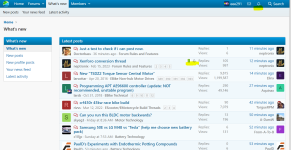
ES 1.0 had more contrast on things, some big borders, and very little rounded corners.
Xenforo has a lot of low contrast / way too high contrast situations, a lot of excessive spacing, and some excessive elements.
The theme you see is sort of a middle point between what Xenforo usually looks like and what ES 1.0 looked like.
I'm thinking that another 10% contrast and a font change should remedy the 'too bright' problem for some people and i'll give it a stab on the next round along with a font change.
PS, are you on a mac, linux, or windows pc... or.. a mobile phone?


 So I just squint a lot and don't read nearly as much of ES as I used to. Eventually I'll probably find something that I can use to make it better at my end without wasting everyone else's time trying to deal with my problems seeing it.
